Moleskine Print & Out of Home Ads
What?
Creating print and out-of-home (OOH) advertisements for consumer packaged goods. The client was Moleskine, a company that is most well known for its notebooks, due to their sleek design and longevity.
Who?
For this project, we were targeting older adults (55+) who reside in the US, in the Baby Boomer/ Gen X age cohort. After conducting some research, we concluded that our audience was creative individuals, who value family traditions. They currently believe that Moleskine is a quality brand, however only necessary for established writers, artists, or professionals.
Big Idea:
Moleskine is a brand that keeps its quality over generations, preserving the most important parts of life.
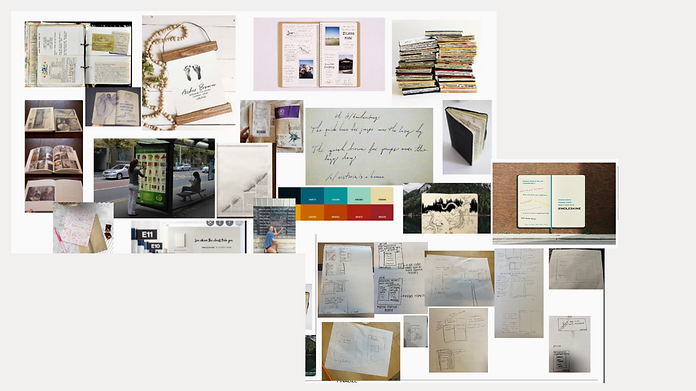
Inspiration & Sketches:
.png)
.jpeg)

.png)
We found inspiration in old family cookbooks and scrapbooks, that overflow with ideas and memories. We wanted to create that feeling of nostalgia when the audience saw our ads. For our out-of-home advertisement, we wanted to create something different, not pedestrian. We thought of an interactive mural, where people would be able to customize the message to themselves. We took the idea from a chalkboard mural, where people were able to write down their own answers to the question "before I die, I want to ...." .
Out-of-Home Advertisement:
.png)
For our out-oh-home ad, we chose to use a mural as our medium. This is also due to the fact that the target audience (Gen X) prefers to receive information through traditional media outlets instead of electronic. We felt that the target audience would appreciate using the mural to write handwritten messages to the younger generations. We also felt that they would appreciate the fact that the ad made people stop and interact with it, which can be rare in the fast-paced world we live in.
The left side of the mural is blank with a prompt encouraging the audience to engage with the ad and write advice for their younger selves with chalk. The nostalgia created by the viewers thinking about their past and writing down advice is a way of connecting the audience with the product.
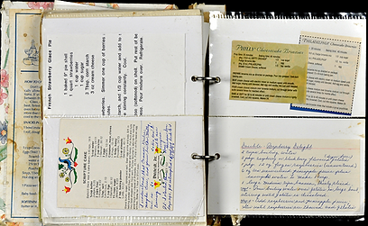
Print Advertisement:
.png)
The concept behind the recipe book is to express the importance of tradition and saving memories through writing. We want the audience to see that Moleskine keeps these traditions alive throughout generations and the quality of the notebook is one consumers can trust to safeguard their most precious memories.
In both of our copies, we included the idea of “holding on to” in the headings.
We wanted to portray the idea that Moleskine was meant for holding some of the most important memories and messages. The verb “holding” in our copy was chosen deliberately because a Moleskine notebook is a product you can physically hold, as well as hold your personal traditions and memories. We also wanted the quality and durability of the notebook to be mentioned which is why we included, “Keep it safe with Moleskine”.
Created with Anna Thornton, Sid Arkalgud, and Arainn Murphy
Designed in Adobe Photoshop and Adobe Illustrator, 2022
My role: Copywriter, Concept Designer, Out-of-Home Graphic Designer